Disney’s Paperman: A traditional innovation
Once upon a time, between 1929 and 1939 Disney Studios released 75 animated shorts that came to be known under a common name – ”Silly Symphony”. This was more or less the only thing these animated films shared, besides the fact that they were used to test new methods, characters and animating techniques. During the decade they were produced, “Silly Symphony” won 7 Academy Awards for Best Animated Short Film. The Second World War put an end to all silliness in Disney Studios. With Walt Disney’s own attention turned elsewhere, animated shorts fell out of favour, as did the experimentation with new methods and techniques. It was to take decades until Walt Disney Studios won an Oscar again.
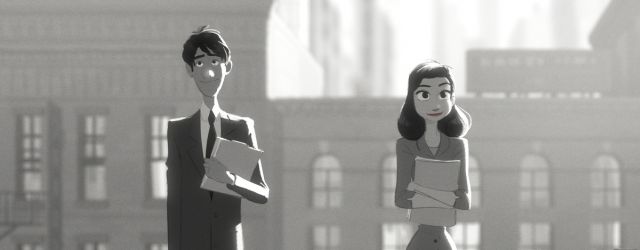
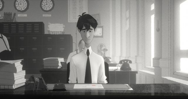
2013 was the year, when Academy Award for Best Animated Short Film was awarded to John Kahrs’ “Paperman” – a romantic animated short, employing a new hybrid technique for merging 2D drawing with 3D computer graphics (CG) animation. Kahrs supposedly got the idea for the story in the early 90s when he used to live in New York and commute through Grand Central Station, where he remembers watching people and wondering about the passing random connections. The story was kept on the sidelines for a long time due to the studios main focus on the full-feature animation “Tangled”. However, the leftover drawings from “Tangled” had a great deal to do with fuelling the imagination behind the visual appeal of “Paperman”. Kahrs simply thought that the hand-drawn animation sketches were too beautiful to be left behind and started wondering how they could be included in the final production.
Solution for the problem turned out to be already in development, albeit in an unrelated context. Brian Whited had been working on a vector drawing tool for a while, with a basic aim to try to convert 2D animators from working with paper to working with digital tools. None of the existing tools had proven successful due to their impreciseness compared to hand-drawn line. As Whited put it in his interview on Fastcolabs.com : “I would make a little demo, and I would go to an artist and ask them to draw curves, over and over again and say, ‘Does that feel right?’ and they’d say ‘Oh, that’s a little off, that’s not exactly what I wanted.’ That was probably the first six months of development.”
Why curves? Turns out, there’s a catch about digital tools and drawing curves. A computer can represent a line either as a vector or a bitmap. As vectors can be scaled up and down without getting jaggy, most professional drawing software is vector-based. However, drawing or sketching on a computer or a tablet means that the line drawn is not the line shown. The final line is actually a vector that the computer tries to match with the original line and it cannot make a precise match – meaning that the computer subtly redraws and changes the original line. In a drawing that relies on few well-placed lines, this can change the whole expression and character. The Whited’s new software Meander that “Paperman” was created with is trying to correct this, so the original line would remain exactly the same.
So, how was this love child of 2D and CG actually created? Insidemovies.ew.com gives a point-by-point overview. The long and winding road starts with storyboards, for “Paperman” created by John Kahrs. The next stage after storyboards is layout which in a regular movie would be called camera work. All characters are animated in CG (computer graphics) in order to create a base for the hand-drawn ‘top layer’. Key poses are drawn on top of the CG animation by hand and the strongest lights are added. Finally the last and most complicated piece of hand-drawn animation – movement of hair. And in order to finalize the animation, the compositing team takes over and “puts a little film grain back in, adds some light effects and motion blur. It kind of seals it all together.”
An even more detailed overview of the animation process can be found here and on Youtube.


